Mumbai suburban rail is one of the busiest rapid transit systems in the world — operating more than 2000 train services and carrying more than 7 million passengers daily. Rail map plays a critical role in providing the travel related information to help commuters navigate and guide them towards informed decision-making prior to the journey. Need was for a well designed Rail Map. So two IDC, Communication design students Jaikishan and Snehal took up the challenge.
- Home
- Blog
- Map Stories
- Design of the Mumbai Suburban Rail Map
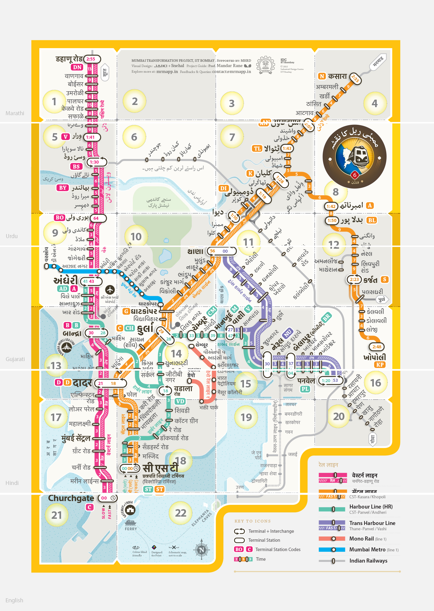
Mumbai Rail Map . मुंबई रेल नक्शा . ممبئی ریل کا نقشہ . मुंबई रेल नकाशा . મુંબઈ રેલ નક્શો
Design of the Mumbai Suburban Rail Map
Design for People
Interview with the designers:
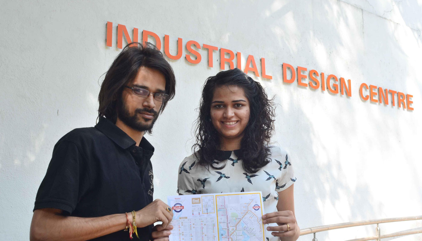
Jaikishan Patel (Jaiki) and Snehal Patil
By:
Prof. Mandar Rane
Industrial Design Centre
IIT-Bombay, Mumbai
Why did you choose to design a Mumbai Suburban portable Print Rail Map?
Snehal: I have lived in Mumbai and I know most of things about Mumbai. I felt designing a map would be exciting and of value for people in Mumbai. I researched about it and then understood that though there are a few maps on the internet but none of them is well designed.
You and Jaiki were working together but it seems you had done the maps individually and later it was merged into one?
We did the groundwork together. Afterwards we made two different versions of maps. We have shown iterations regarding how we went about it. In a way this technique seems to be more useful when it came to design decisions and arguments. Looking at the two completely different approaches for the same visual design problem, we could articulate many reasons why to include or eliminate certain visual elements. Arguing with and against us we finally proposed an ideal solution governed by functional prioirties.
Snehal’s first Iteration of the Mumbai Railmap:
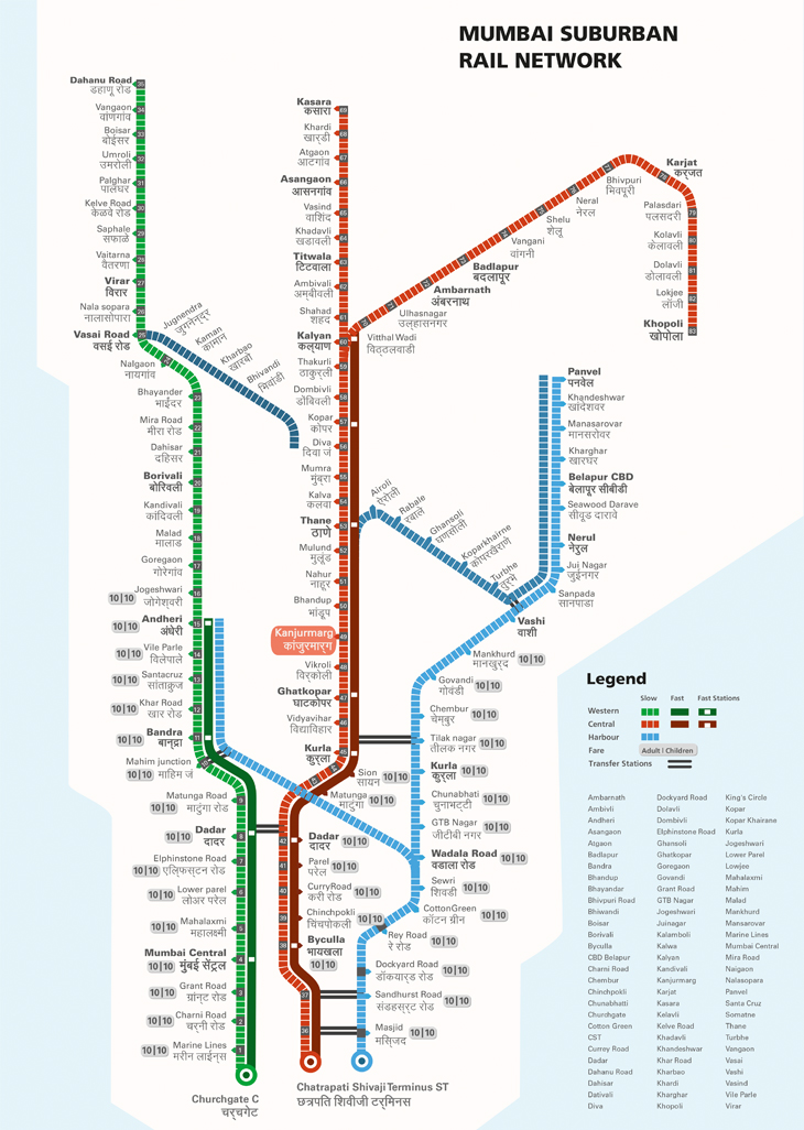
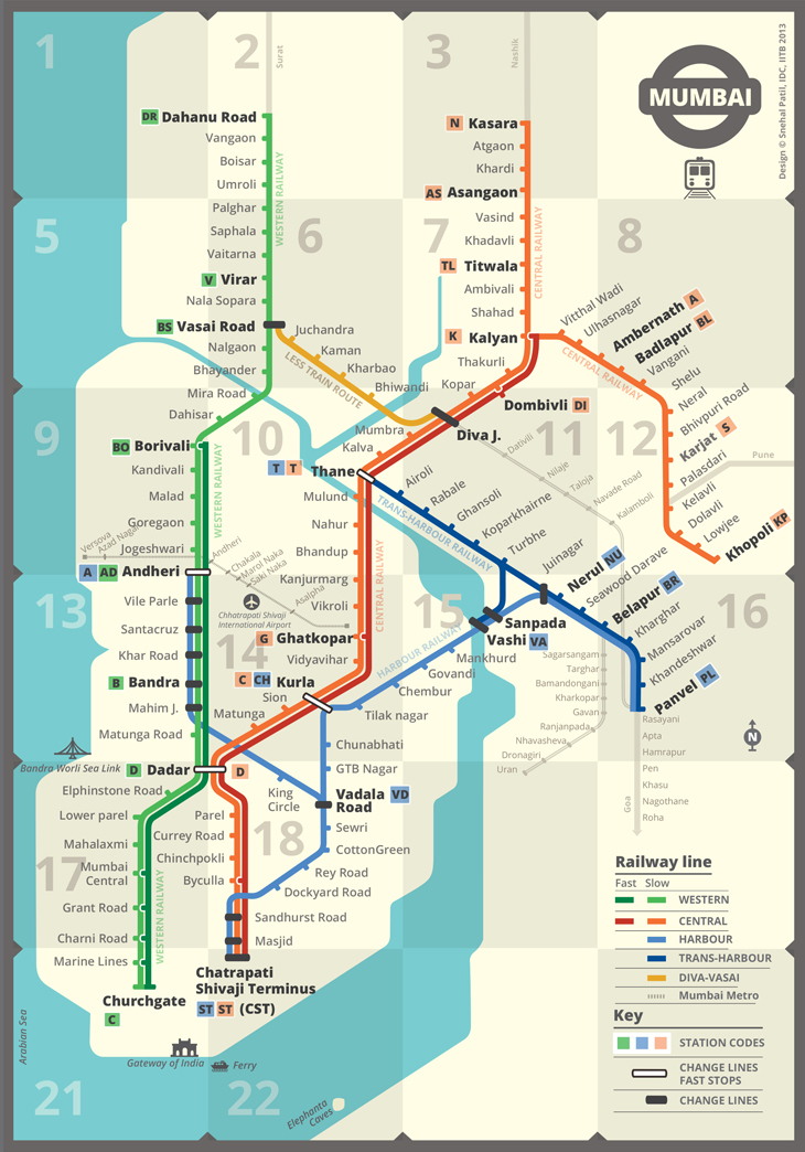
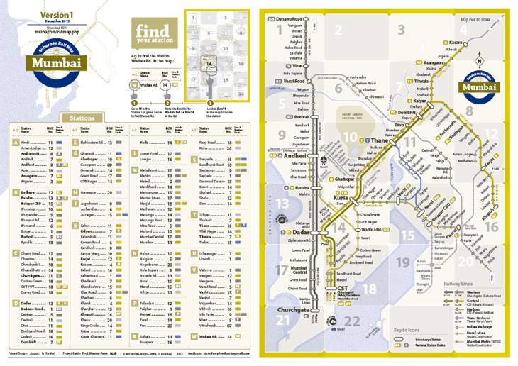
In the first map Snehal tried numbering the stations, so even an person who is not literate could navigate stations by minimal guidance . But managing new stations and numbers have to implemented as a policy and was not the current reality of the system. So considering the current context we dropped the idea of numbering stations and considered it as a constraint. She also changed the logic of dashed lines for slow trains and continous lines for fast trains which was vice versa in the maps that were floating on the internet.
Snehal’s second iteration with index:
She does away with the fare and tries a new version. The fast trains were shown as dotted lines which were changed to continous lines. The line had a logic of the lighter colour for the slow train line and darker shade of the same colour for the fast train line.
Snehal’s final Iteration:
Utilmately incorporating all the routes Snehal reached her final version, later to be changed and merged with Jaiki’s iterations. The final map to be downloaded from the above link is a culmination of both the maps. Now they were a team.
Why did you choose to design a Mumbai Suburban portable Print Rail Map? Jaiki?
Jaiki: I like to travel, I have travelled along all the routes for no reason. I am fond of maps. I have Eicher map for all the cities and recently I brought a map for Mumbai, when we decided to work on this project. I think, You are not from mumbai? Yes, when I came here, I had downloaded a map from the internet. There were multiple maps floating on the internet. When Snehal proposed the project I thought this is a good opportunity to design a Mumbai Suburban Rail map. Then we got hooked to it.
Jaiki’s Iterations:
Jaiki, I think you started with incorporating the fares…
I started with the fares and it was usefull but some fares across the system did not work well. As we go towards Vashi there is some extra tax and the fares then are not consistent, where the fares were consistent we managed to incorporate them in Map. We could have done zones as in the London Underground Map. These were You are here (YAH) maps with fares, therefore kanjurmarg was highlighted.
Later you completed the whole map with Station index…
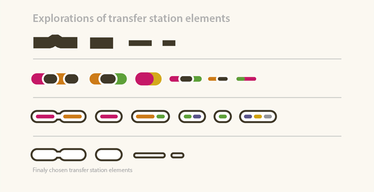
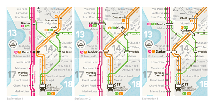
Yes, Strangely all the Maps floating on the internet do not have an index. There were still some issues to be tackled at that point in time and I messed up with the visual order. Therefore the blue route gets unnecessary prominence. The coding for transfer stations was confusing and required repair. I had done black capsules with white outlines for fast train stops. We were told, “A good map should use minimum legend” We were trying.
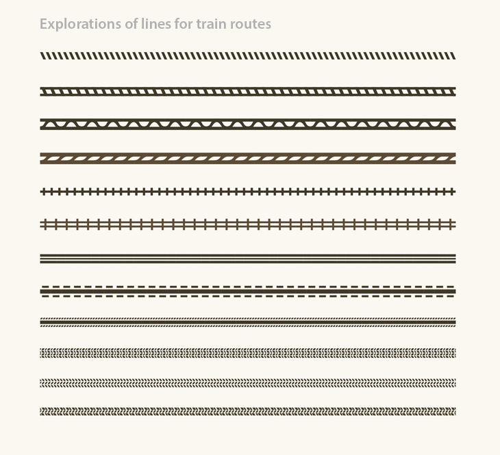
You also explored various line textures for routes and even transfer stations.
Yes, it was adding complexity to the overall appearance, So I dropped it later. I understand that if the lines (routes) increase the colour differentiation will not be visible, as Jacques Bertin points out in his book ( colour as a differetial variable) . Transfer icon works best when the lines pass through below the shape. Mentioned below are a few transfer icons I explored before reaching the final.
Why do both of you think a map is required when people are already navigating in Mumbai?
Yes, this is a point of classic debate. When there are so many people round the clock in Mumbai, why do we need a Map? Another point is will people use them? We have two points to argue: 1. People were never presented with a well designed map, so to speculate whether they will use them is questionable. Lets give them a map and then decide. 2. Every new traveller is introduced to the Mumbai Locals in a very complicated manner. There are three local lines and without any overview is a confusion for sure. They have no other option but to ask the people around them to navigate on the routes. Asking people can be one kind of risk (the authenticity of information). Therefore people keep on confirming by asking multiple people. Having an authentic map can resolve the problems people face. Travelling from point A to B is one need, but to orient oneself to the city is another. With the new design the traveller can have an overview of the Mumbai Suburban rail system at a glance and avoid detours. I had given you a book to read about the Mr. Beck’s underground map a book by Ken garland? The major shift of visual design for map was done in 1933 by the technical draughtsman Mr. Beck for the London Underground. His famous digrammatic map introduced colored lines to differentiate routes which are aligned in a grid and particular angles. The result was an instantly clear and comprehensible map that would become an essential guide to London. It was an interesting read before we went to design one for Mumbai.
Our trains are not underground then why did you choose to do a map which looks like a London underground? Whats new, it just looks like one more map?
Mr. Becks London underground map is a visual system which solves problems of navigation and therefore we think it is not necessarily about underground trains. It is orderly and tries to reduce clutter by segregation. Navigation from one location to the other is easier. Colour coding is introduced for proper differentiation within lines. So adaption of such a methodology of map helps in solving navigation problems and detours for the traveller. We thought there is no need to force a personal style for designer satisfaction when the visual system works. Our map is diagrammatic representation of Mumbai local train network mapped over slightly abstracted geography presented graphically. It shows relative position of stations along the lines.
I see you have used various colours in the map, what about the colour blind population?
According to statistics approximately 13,956 people from different regions in India, suffer from colour-blindness. We have tested the map for the same and made changes accordingly. In the map design it is been considered to an extent that people with colour blindness can differentiate among the routes by the tone and thickness of the rail lines. In that way, the map would be still useful in case of B/W print.
Given below are the versions of how the two types of colour blind people would view the Maps. We made the changes in the final accordingly.
Protanopia: A form of colorblindness characterized by defective perception of red and confusion of red with green or bluish green.
Deuteranopia (also called green-blind). A form of colorblindness characterized by insensitivity to green
Can you explain the challenges you faced in this project?
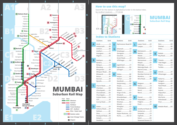
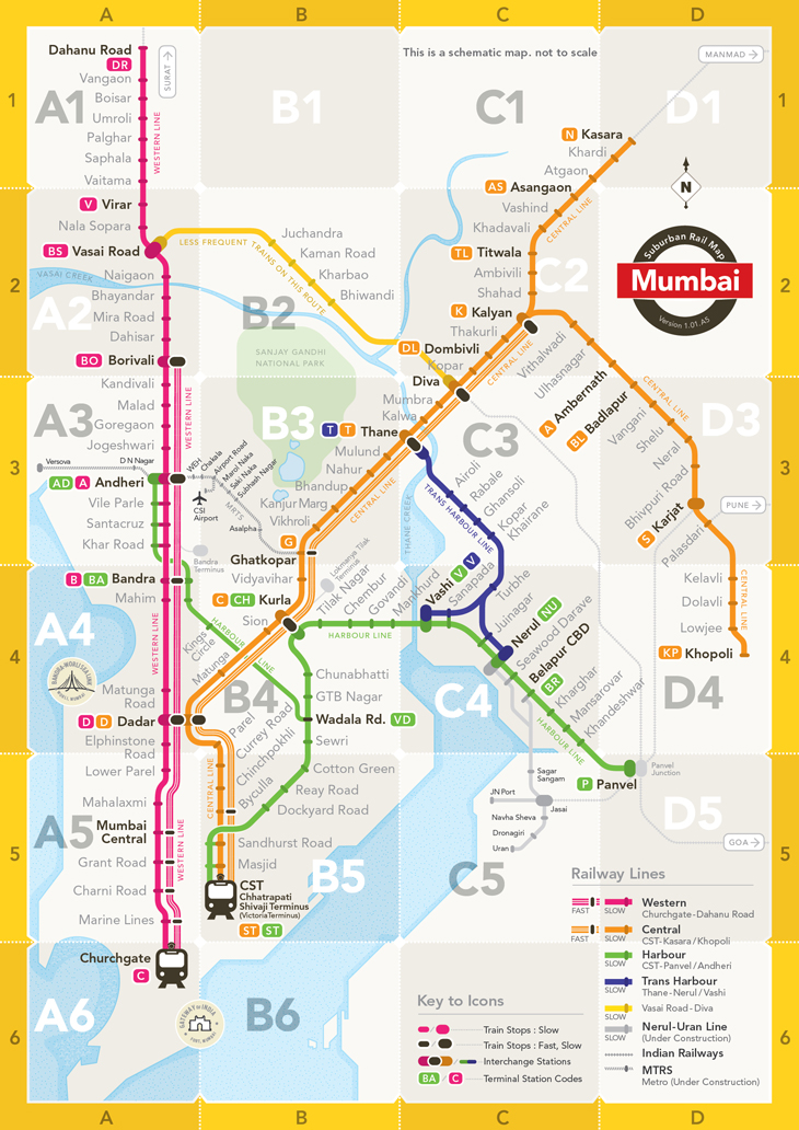
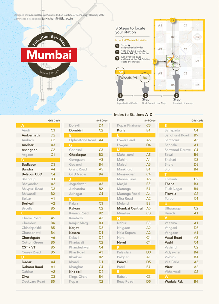
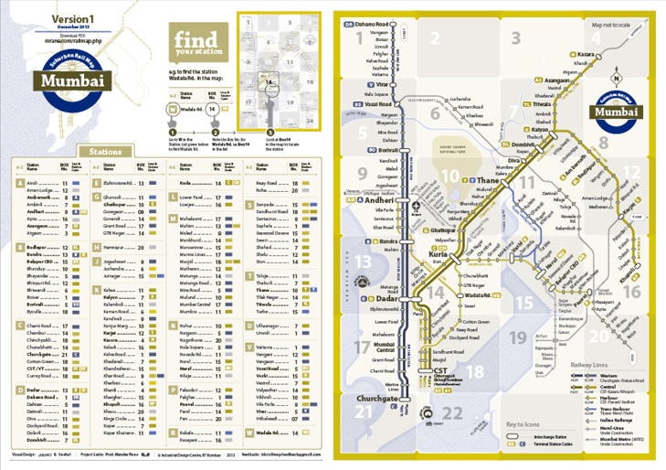
Developing a navigation system was a challenge and the other one was to make it small and portable, (i.e. to accommodate all the lines in a small size of A5 was a struggle plus make it legible. The current maps floating on the internet somehow do not have an index or an alphabetical listing to search train stations. We are very inquisitive, about who does them? Someone is concerned. One can argue that Mumbai rail map is not so huge in scale and therefore it may not require a criss-cross reference alphanumeric grid. We wish to differ on this point. We had done that in our earlier versions of the map. See earlier iterations given above. On one incident while testing, IDC student: Vishnupriya pointed out that why use a criss-cross reference alphanumeric grid when the space is so small? She suggested why not just mention a number for each box. The traveler has to just look up the station in the station index, then the adjacent number. Later to look for your station in rectangular box with that number. We feel we have made it easy. We would appreciate feedback.
There are already maps for Mumbai Suburban Rail, what is unique about your map?
1.Our map introduces a quick navigation system, which lets the user locate his stations within seconds using the box grid. We have introduced grid system in a different way. Its slightly modified in comparison to the traditional grid which has alpha-numeric coordinates. This consideration was from our study of most Indians who are not accustomed to criss-cross alpha numeric grid, excluding people who have travelled abroad where the criss-cross alpha numeric grid is very common.
2. We have included shuttle express way which runs from Vasai to Roha.
3. Clear distinction between Fast and Slow local stops which few maps don’t provide.
4. Pleasant and appealing visual appearance where beauty is functional.
5. This map is designed to accommodate the colour blind population.
What’s the plan? How do you wish these should be implemented?
What we dreamt was such (YAH) You Are HereMaps are installed at each stations for commuters. It should be also available in print form as shown in the picture below. We wanted the map to be portable so people can carry it with them. It will be handy for tourists. We have reduced the map to 7cms x 5cms which can easily fit into a wallet when folded.
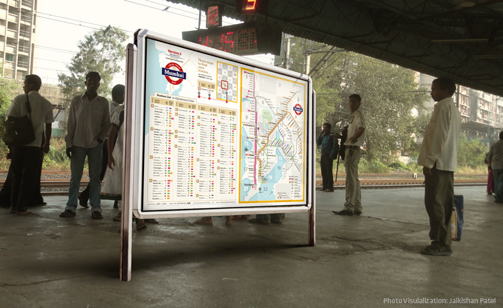
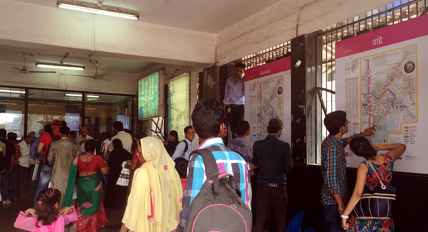
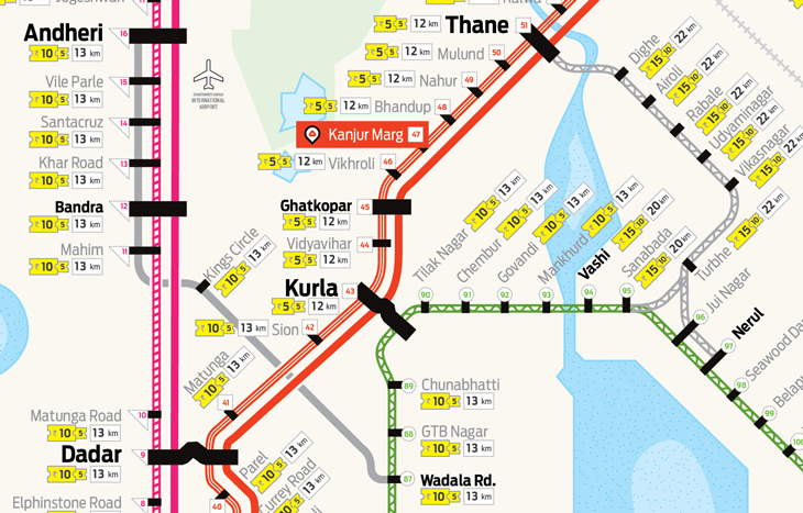
How and where to install?How and where to install? Visualization for Kanjurmarg Railway station – Central Railway. Such maps should be installed at the ticket counters before someone starts his journey. Maps should be integrated with ticket/coupon vending machines. A separate map should be installed on the platforms so the mental model of the rail network for travelers is clarified over a period of time. This is a latent need but of utmost important. Overview of any complex systems avoids detours and the crowd is channelized meaningfully rather than people opting only one way of travel due to lack of information.
Snehal’s Pocket Map for Mumbai Local trains:
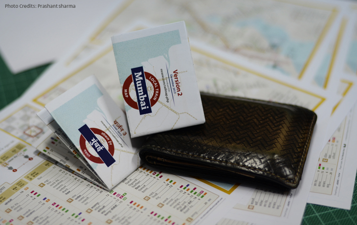
If the dream of posting back-lit boards of
Jaiki’s visualization on railway stations does not come true for any reason. It may be lack of implementation will, bureaucracy, etc., then this is the alternate way to give the city a Personal Pocket Map. DIY, don’t wait for things to happen!. Folded version of the map should be made available at all stations across western and central railway. One side is English and the other side is either Hindi, Marathi or Gujarati. Open size dimension: A4.
Interview ends.